B Y T O M T O R T O R I C I
Your company’s website probably already seems pretty friendly. To you at least, since it was developed from the input and sensibilities of company insiders like you.
The thing is, the actual audience for your website may have a whole different set of sensibilities, considerations, and priorities. Professionals trying to sell something, and folks searching to resolve a pesky issue, are approaching things from very different angles. They just are.
In the following examples, we’ll look at how to make the conversion from a company-centric to a customer-centric website. Because chances are, you yourself have abandoned other companies’ websites, for making the same mistakes your site is making right now.
__________________________________________________
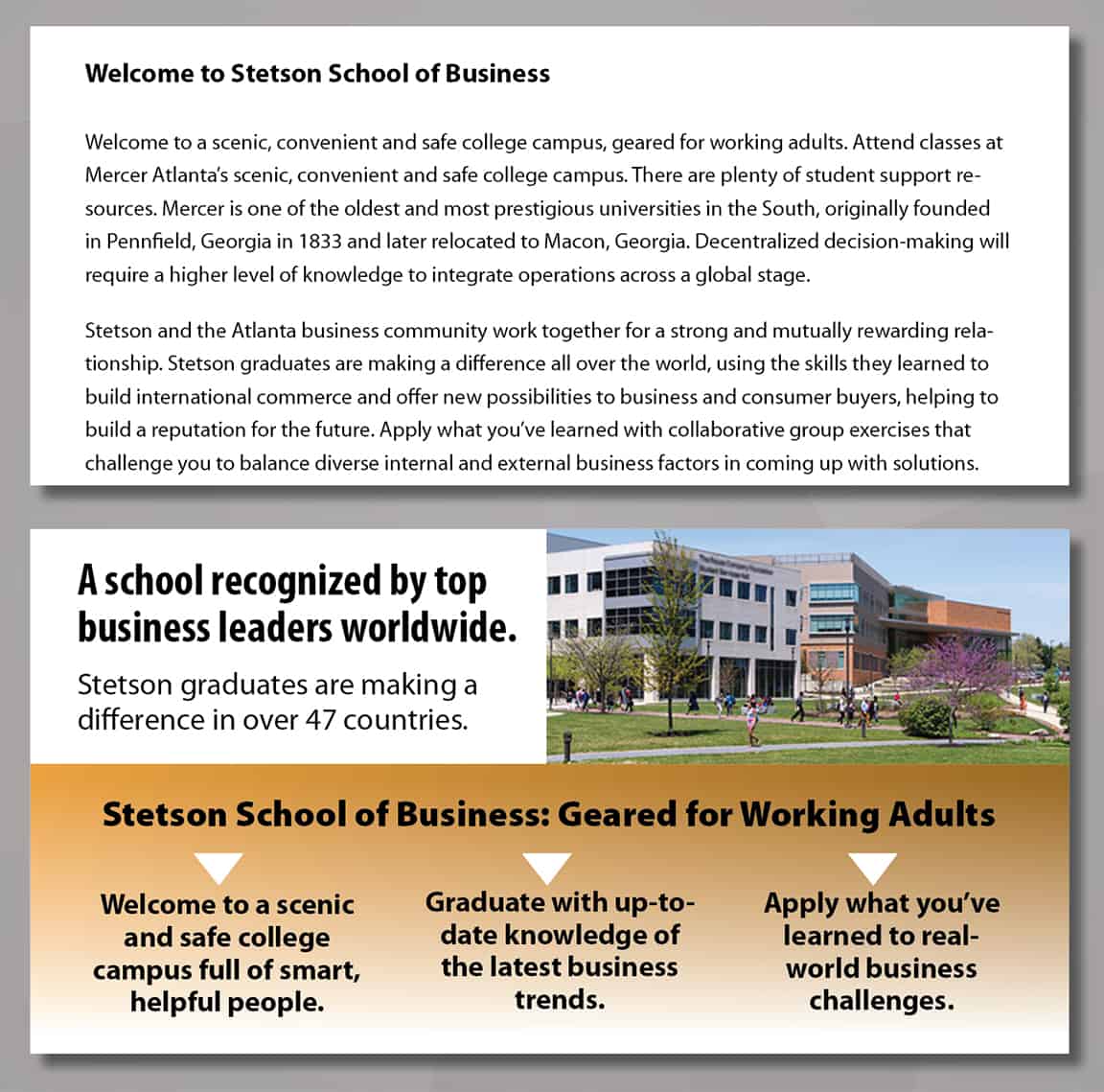
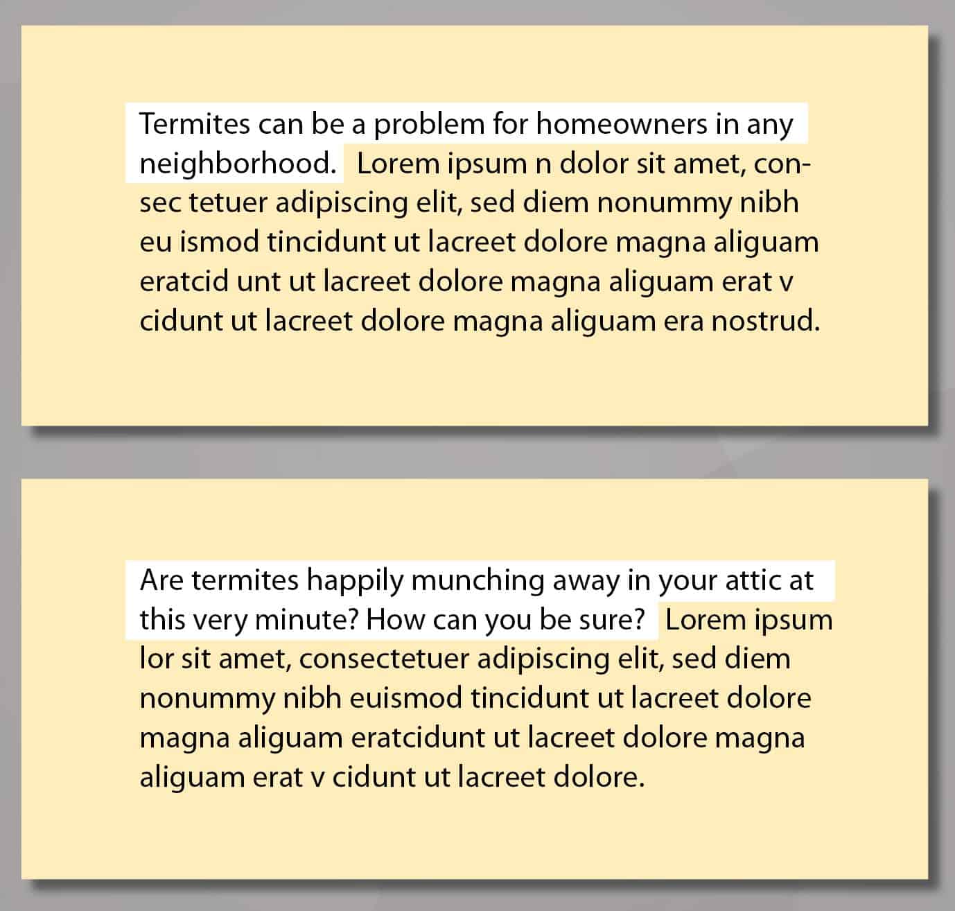
1. From Running Text to Bite-Size Content
On the top, all that paragraph text just makes people’s eyes glaze over. It could reveal the secret of life itself, but unfortunately no one will get that far, since landing on that wall of text is like hitting a … wall.
On the bottom, ideas are offered in bits that the eye can absorb in one ‘gulp.’ All readers start by initially ‘scanning’ a web page. Make it easy for them, with prominent ‘hooks’ that catch the eye, then draw it in.
__________________________________________________
2. From Company-Speak to Customer-Speak
On the top, company employees make it all about themselves, from their point-of-view, with over-use of the words we and our. Plus they’ve apparently stolen all the self-centered marketing clichés they could find.
On the bottom, they take the customer’s POV, by acknowledging their needs, and concerns, as they themselves see it. Then a confident resolution is offered, in a way that makes the customer the hero of their own story.
__________________________________________________
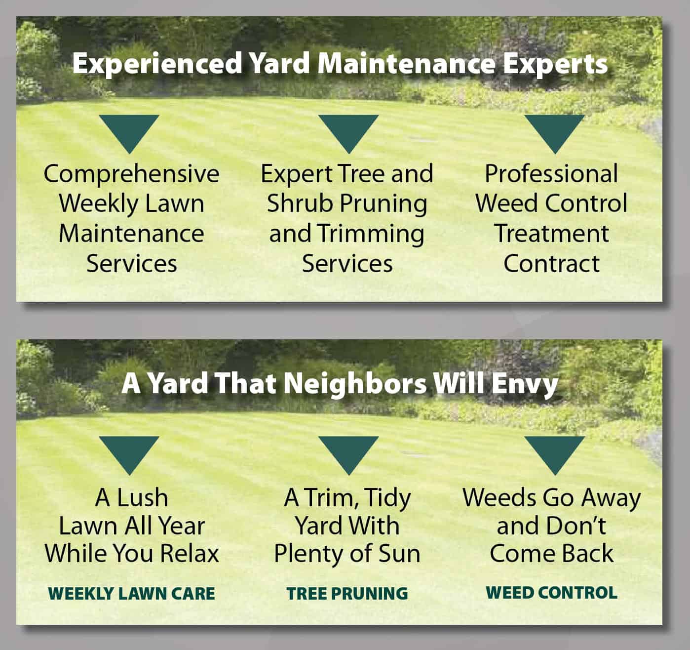
3. From What-You-Offer to What-They-Get
On the top, is a headline that once again, reflects how employees want to view themselves, followed by the actual physical services they perform. It’s what readers often see, but not what excites their imagination.
On the bottom, the emphasis is on the homeowner, offering the secret satisfaction of other people’s oohs and aahs. That’s followed by other sweet benefits that are much more likely to tempt them into responding.
__________________________________________________
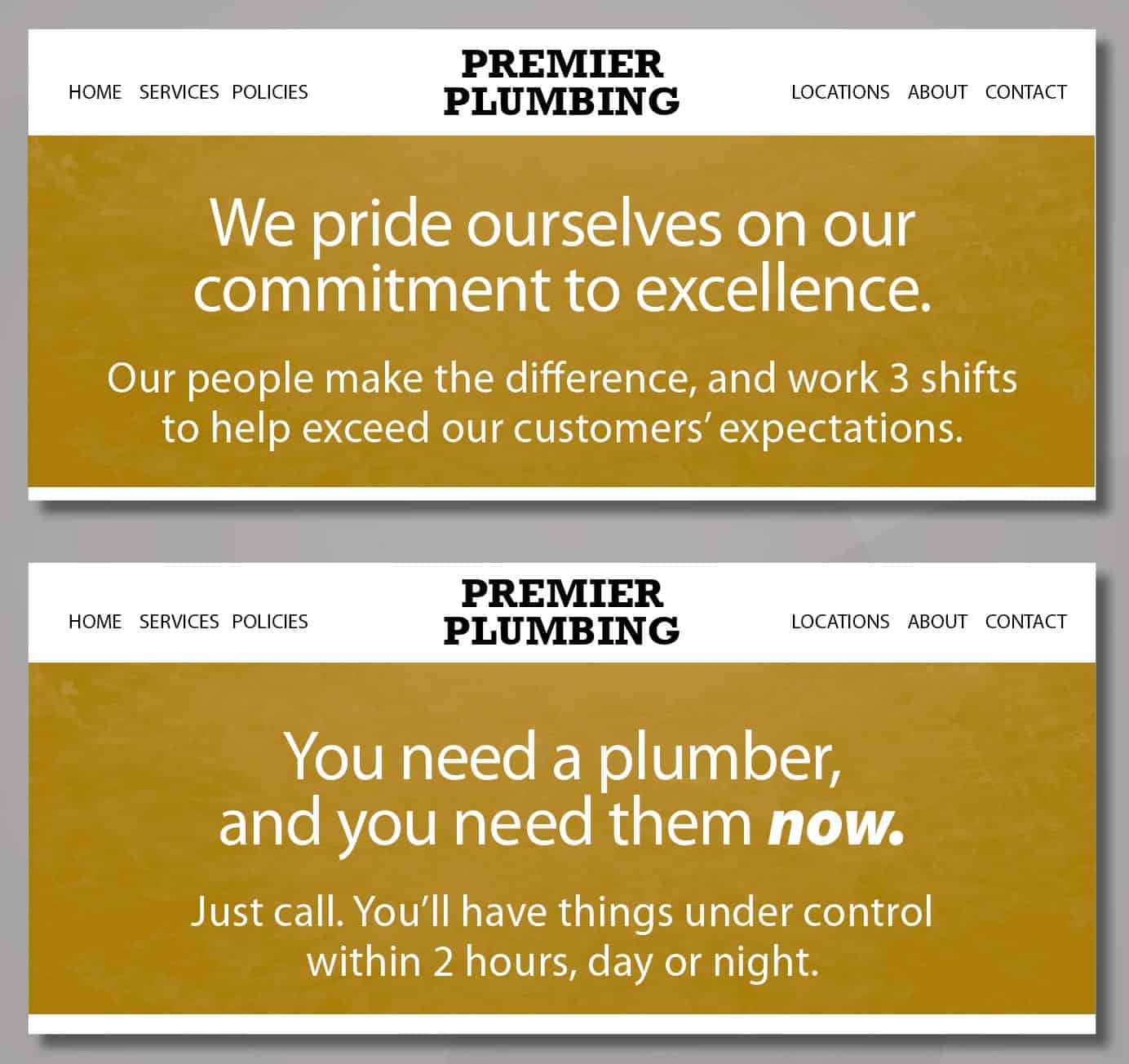
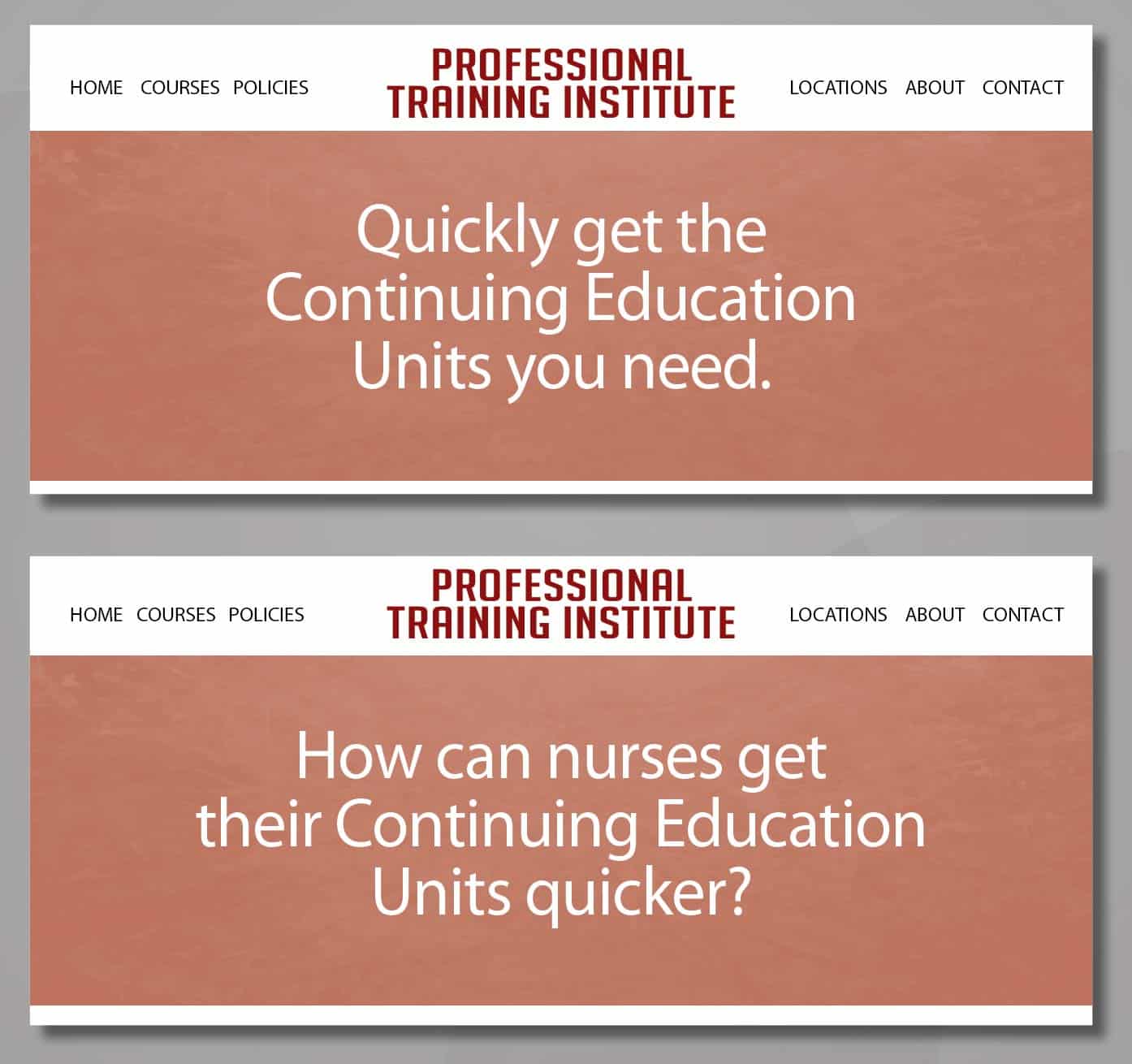
4. From Boring Statements to Strategic Questions
On the top, the headline does get across an actual benefit to nurses who want to get this year’s professional courses out of the way. Simple and clean, yes, but could there be a stronger approach?
On the bottom, a question is posed that makes the reader curious, and that curiosity is what will propel them deeper into your website. Asking the right question can be more engaging than any statement.
__________________________________________________
5. From Wordiness to Brevity
On the top, the company-centric approach requires an abundance of words, which fewer people will take the time to read. Even if it’s what you want to say, that’s only the first step in the copywriting process.
On the bottom, deciding how to say something is the second step. With an implied ‘you’, the same idea is conveyed in a simpler, more direct, and by-the-way much friendlier fashion.
__________________________________________________
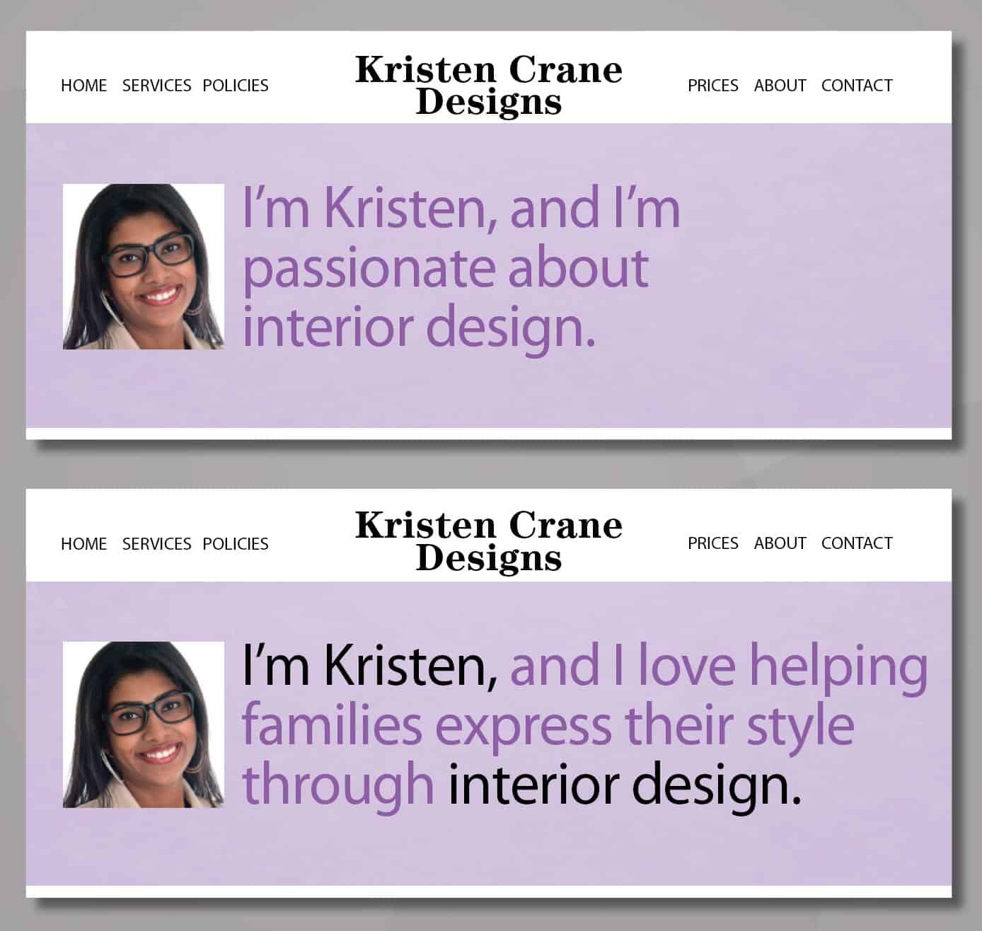
6. From Self-Centered to Inclusive
On the top, the professional seems to be going for a simple, honest approach that’s free of any marketing verbiage. Unfortunately, her self-centered ‘story’ seems to have no room for anyone else.
On the bottom, she makes a genuine connection with the customer, by showing how they benefit from her natural talents. Yes, it’s a longer headline, but in this case it’s conveying much more of value.
__________________________________________________
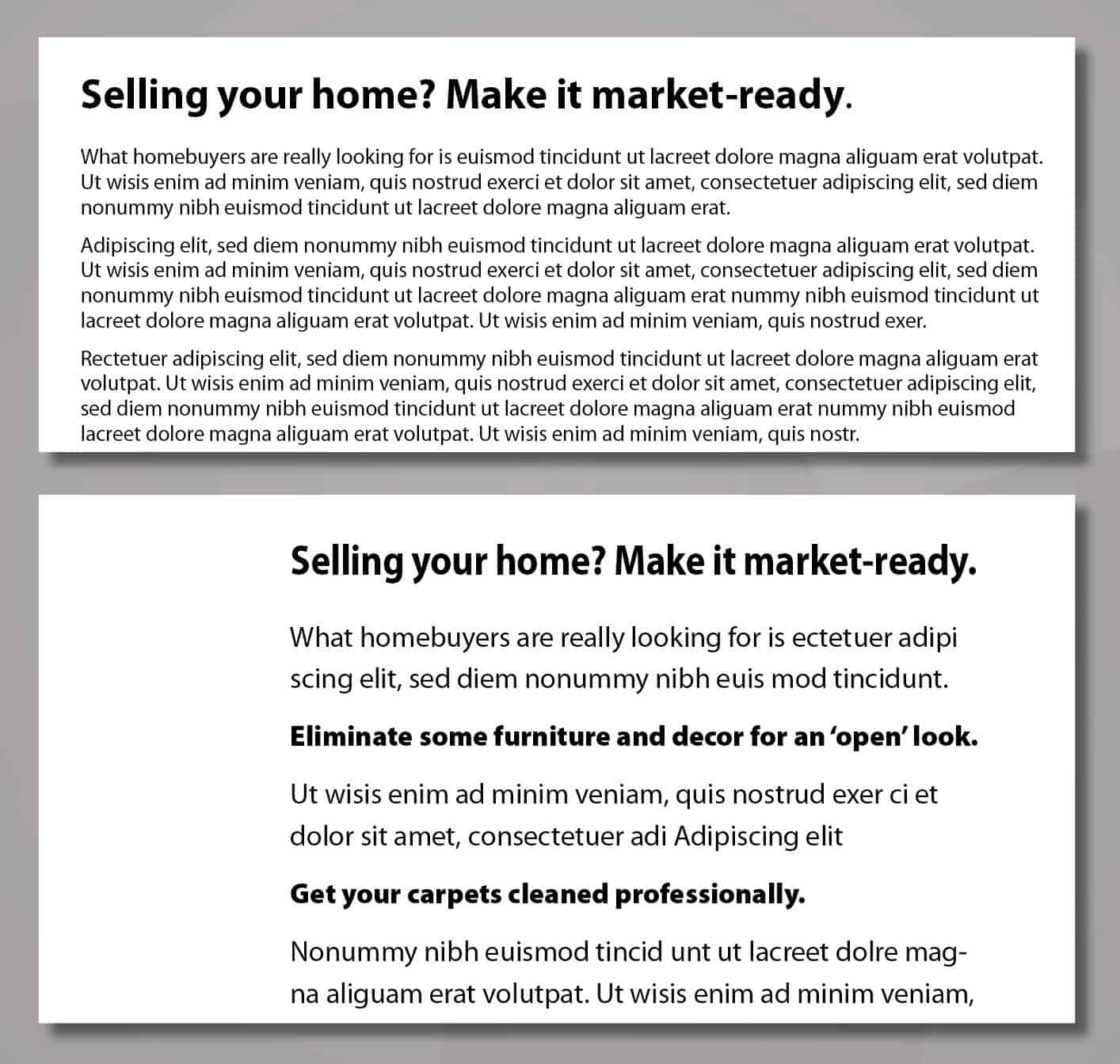
7. From Hard-to-Read to Easy-to-Read
On the top, unlike website ‘selling’ pages, paragraph text is appropriate for blog posts and deep-dive information pages. However it still intimidates the eye, even for people who are interested in the topic.
On the bottom, that running content is clearly more eye-friendly. The difference? A larger font. More vertical spacing between lines of text. A narrower text width. And bold headers that draw the eye in.
__________________________________________________
8. From Blah Openings to Compelling Openings
On the top, a pest control company begins their text with a vague and obvious statement. Viewers can only assume the rest is vague and obvious, so why bother to read it? It’s a disturbingly common problem.
On the bottom, the text opens with a question that grabs the homeowner and takes them by surprise. By posing the uncertainty of a potential threat, how could they not keep reading – and not follow up?
__________________________________________________
If your website looks more like the ‘Before’ examples than the ‘After’ examples, clearly there’s work to be done. If you can successfully use this guide to make improvements yourself, well, power to you.
Though if the ideas above make sense, but you’re not sure where to start, perhaps I can help. Because as a strategic copywriter, ‘translating’ from company-speak to customer-speak is at the core of what I do. And it could be your competitive advantage over competitors who don’t know what you’ve just learned.
Ready to make your company website truly reader-friendly? Call Tom at 404-606-2715 and let’s chat about the possibilities.
Share It:
 About the Author: Tom Tortorici is an Atlanta copywriter and web content writer who helps companies make a genuine connection with their audience. His classes and conference presentations have focused on how writing, strategy and design can work together to grab attention and interest even among readers with short attention spans. In addition to working directly with businesses, Tom regularly partners with web designers and marketing agencies.
All Posts/Subscribe >
Info for Businesses >
Info for Designers/Agencies >
Tom Tortorici Inc. | Tom@TomTortorici.com | 770-934-7861 | 3101 Rockaway Rd | Atlanta GA 30341